


According to a report by Forbes, Data Scientists spend 80% of their time on data management—cleaning, labeling and annotating. This means there's much less time for doing the core data work that businesses need.
Here, we offer 4 tips to reduce time spent on those time-consuming tasks, and free up time to refine algorithms and mine data for patterns. Added benefit: the time recovered also helps teams make better data-driven decisions.
More Tools, More Problems
One of the reasons cleaning, labeling, and annotating data is so time consuming is because of the number of tools being used. It’s common to start with SQL or a Jupyter notebook, and then create charts in Excel, Tableau, or Power BI, then take screenshots of them to embed in presentation slides.
Hopping between three, four, five, or more tools to stitch together an end-to-end data workflow - exploration, analysis, modeling, and communication of findings - adds complexity, room for misinterpretation, and manual errors. It certainly doesn’t help streamline the workflow.
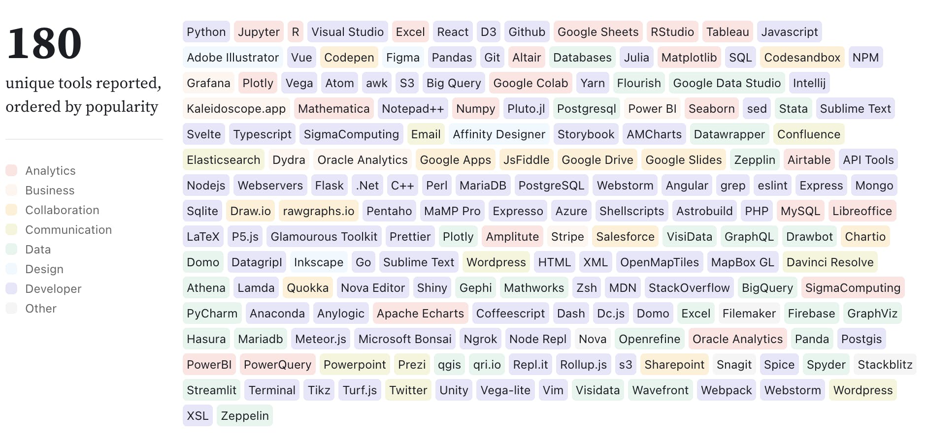
Our 2021 research report — The State of DataViz — found that the team members involved in the above workflow use two, three, four, and sometimes even more tools to stitch together an end-to-end flow to analyze data and communicate insights.
In fact, there were more than 180 unique tools named by respondents, optimized for different roles with different skills (see color-coded diagram below), that are involved in the data workflows.
Fewer tools reduce knowledge workers' mental strain
Tool-hopping also forces us to switch context. While it may be subtle to those experienced and accustomed to stitching together custom data workflow solutions, moving between tools requires us to stop working with the muscle memory of one tool and pick up another.
According to a joint report by Qatalog and Cornell University’s Idea Lab, it takes people nine and a half minutes, on average, to get back into a productive workflow after switching between digital apps. And half of the knowledge workers reported a decrease in productivity and an increase in fatigue from constantly switching between tools.
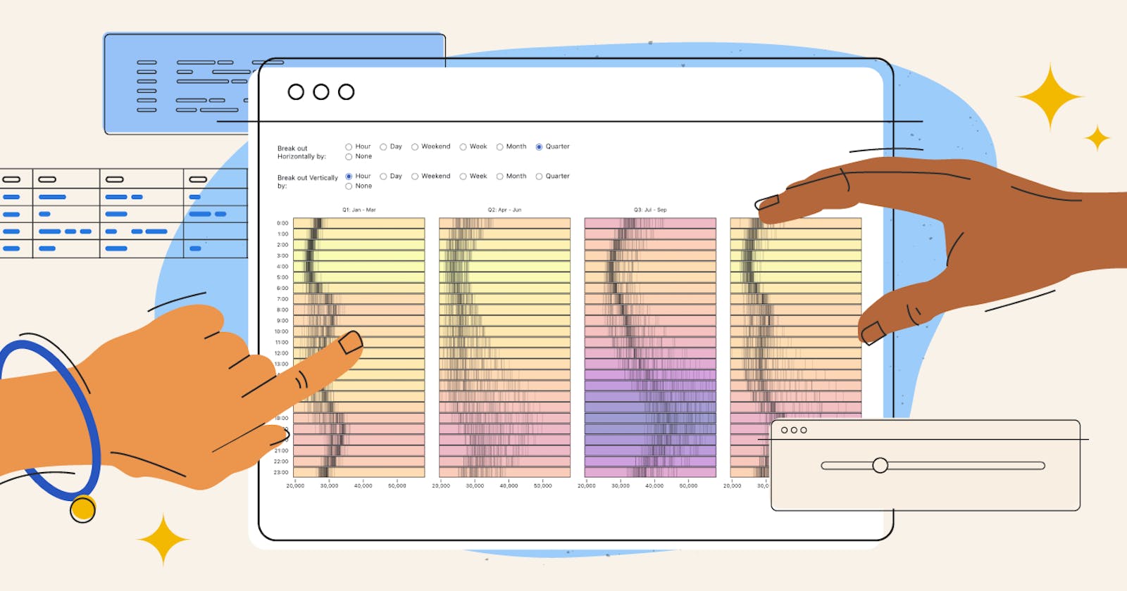
Tip #1: Use one tool to take you from dirty cleaning to exploratory analysis
In Observable, you can see where your data is coming from, manipulate it with visual tools, create charts in seconds, and pair prose alongside code.
See where your data is coming from. Pull data into an Observable notebook, whether that data is written inline, saved in a local file, fetched from a public or private web API, or stored in a live database. Learn more here.
Manipulate data with visual tools. Use Observable's Inputs to quickly create sliders, radio buttons, and other custom filtering tools to see different cuts of the data more clearly. Learn more here.
Create charts in seconds. Observable Plot's goal is to help you get a meaningful visualization quickly. It has a free JavaScript library, a concise and (hopefully) memorable API to foster fluency, and plenty of examples to learn from and copy-paste. Learn more about Observable Plot here.
Pair prose alongside code. This very article pairs prose alongside code. You're reading the prose here. Take a moment to scroll up to the image showing 180 unique tools. If you click on the caret to the left of that image, you'll see the JavaScript code that corresponds to that image.
Tip #2: Speed up data-cleaning
Cleaning data can be both time consuming and frustrating, especially when data is collected from different sources. Dealing with format mismatches, null or missing data, and unruly joins can eat up time that is better spent on mentally challenging work that still must get done, no matter how long data-cleaning takes.
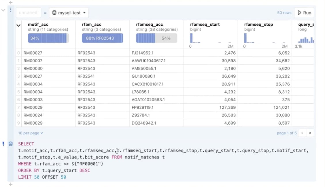
On Observable, use SQL natively as a Swiss Army knife to transform, join, and clean data on your terms, securely connected to your data.
Tip #3: Accelerate the data collection process
You may be collecting data from qualitative surveys, fetching product data, or creating new datasets from various sources. The disparate tools used by most data scientists to collect data for analysis range from a menagerie of free, open-source tools to pricey options that do one thing really, really well.
Rather than using several different tools, Observable allows data teams to manage their data workflow (from import to analysis), and present findings in the same place, with no screenshots or exports required. When it comes to data collection, Observable offers several ways to streamline the process.
Munge qualitative data Observable’s powerful visualization tools let you munge and group text data with ease. Generate word clouds, analyze sentiment with Tensorflow, or find surveys that most frequently express dissatisfaction with TF-IDF.
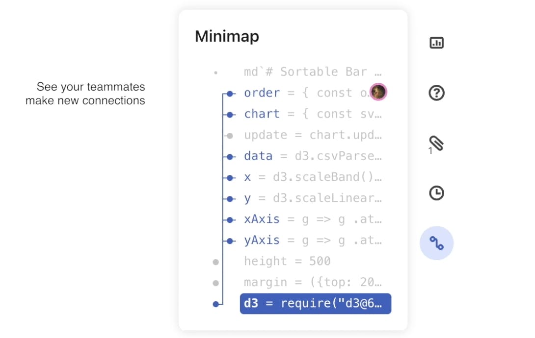
Minimaps offer transparency and security Most product data lives in a cloud-based source. However, the security of these connections is always a concern. Often, it's hard to see exactly what database tables are used to generate a chart or dashboard.
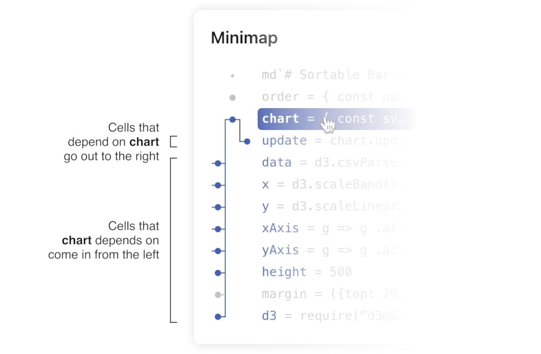
No more trudging through every cell to find a connection error or all the charts that rely on that connection. With Observable’s minimap, you can clearly identify dependencies and the cells that rely on them. See the video below to learn how minimaps increase transparency and security.
Clear database management in settings makes it easy to always stay connected. On Observable, you can connect private Observable notebooks directly to PostgreSQL, MySQL and BigQuery databases. Use the DatabaseClient() to plug live data into reactive visualizations.
Plus, sharing settings allows each team member to be able to interact with your analysis. This way, they see the source of truth the way you can-without having to download, setup, or manage anything new.
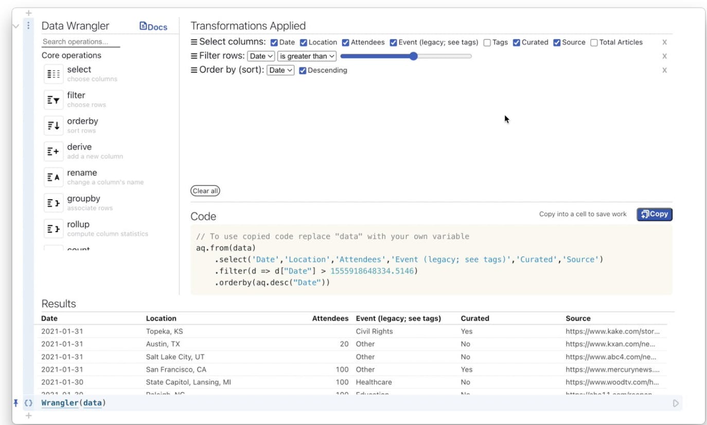
Combining datasets Sometimes the relevant data lives in two wildly different formats, and in different places. Pull together and combine those datasets easily with Data Wrangler, a UI tool that lets you join and select the data you want with just a point and a click.
Tip #4: Quickly mine for patterns
Data visualization is often discussed in terms of what to show stakeholders and clients. However, we can use visualizations ourselves in order to better understand and tell stories about data.
Observable’s Summary Table is a fast way to get a quick, visual overview of a dataset. With Summary Table, you can create scannable data tables and summary charts with the click of a button.
You can also use it to understand the variability and spread of any column. These intuitive tooltips help you decide what further analysis or modeling techniques you want to take.
To get started with a more streamlined data science workflow, and enable your team to get to analysis faster, try Observable for free.